First Impressions of HEY.com
30 Jun 2020
Basecamp's new HEY email service has a take on what email should be in 2020. But, the thought of having it as my primary email does not seem appealing. Gmail works just fine, and I don't see a magnitude of awesomeness in HEY to spend time forwarding emails and using it as my primary email. My bank, the government, utilities and subscriptions that I use are all linked to my current email. I could set up forwarding, but that means I will have my email in two different places. I can use HEY as a secondary email for newsletters etc. but that is not worth $99. It just seemed I would be complicating life. Less is more.
I haven't used HEY a lot but here are my first impressions:
-
Fantastic on-boarding! Even if you don't want to get a new email address, you should sign up to experience their on-boarding.
-
I am not a fan of their UI colours - especially that green for Imbox! Somtimes, the page seems cluttered with too many colors.

-
I am so used to archiving emails. Where is the archive? It is not there.
-
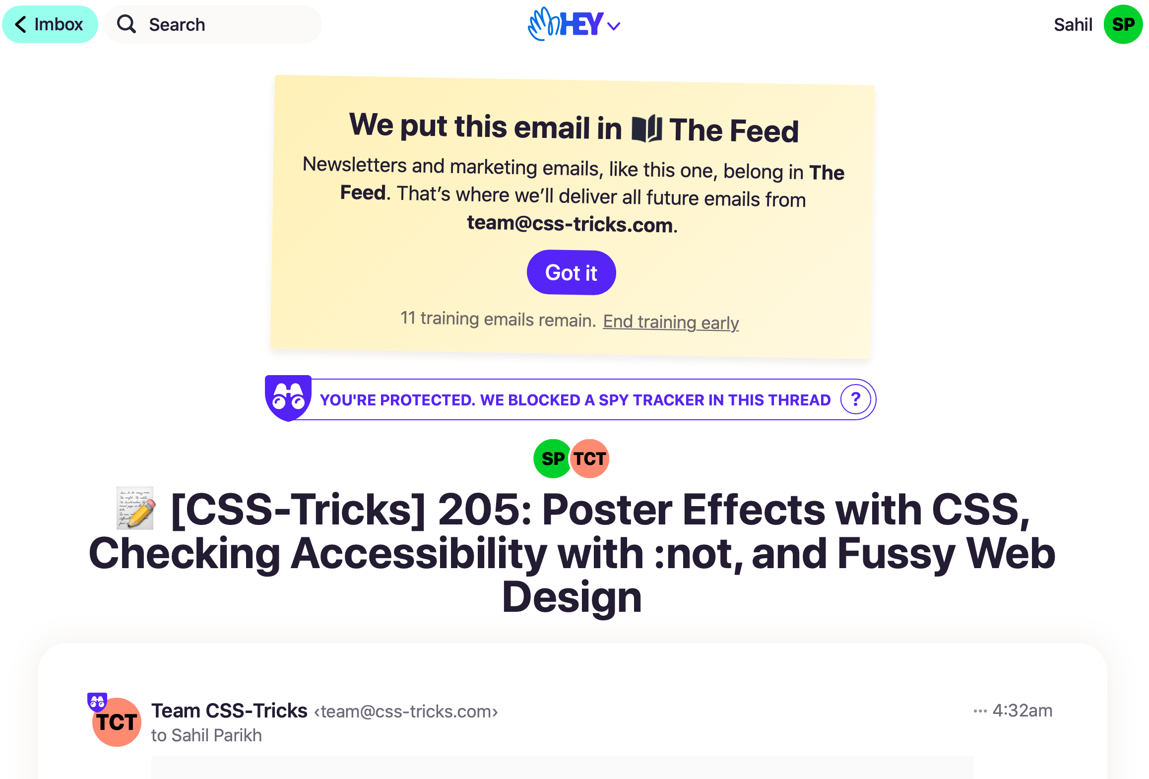
Having a separate section called "The Feed" for all newsletters etc. to me is like using a "read later" service like Pocket/ Instapaper. I know I will never get to it. The only way I read my newsletters is because they are in my inbox.
-
I liked the idea of Screener, Set Aside, and Reply Later. They seem to be new features, but I can do the same in Gmail. Here is how:
- Screener is similar to "Filter messages like this".
- For Set Aside or Reply Later, I star a message in Gmail to move the message to the "Starred" emails (using the priority inbox). These are emails I need handy, or I need to reply later.
- I snooze individual emails in Gmail if I don't need to action them right now and can get to them over the weekend.
A novelty factor is considerably exciting amidst the lockdown and thanks to the HEY team to get me excited. Sadly, this is not for me.
